Kostenloser CSS Box-Shadow Generator
Erstelle CSS Box-Shadow mit Live-Vorschau. Alle Parameter anpassen und CSS kopieren.
Vorlagen
CSS-Ausgabe
box-shadow: 4px 4px 16px 0px rgba(0, 0, 0, 0.25);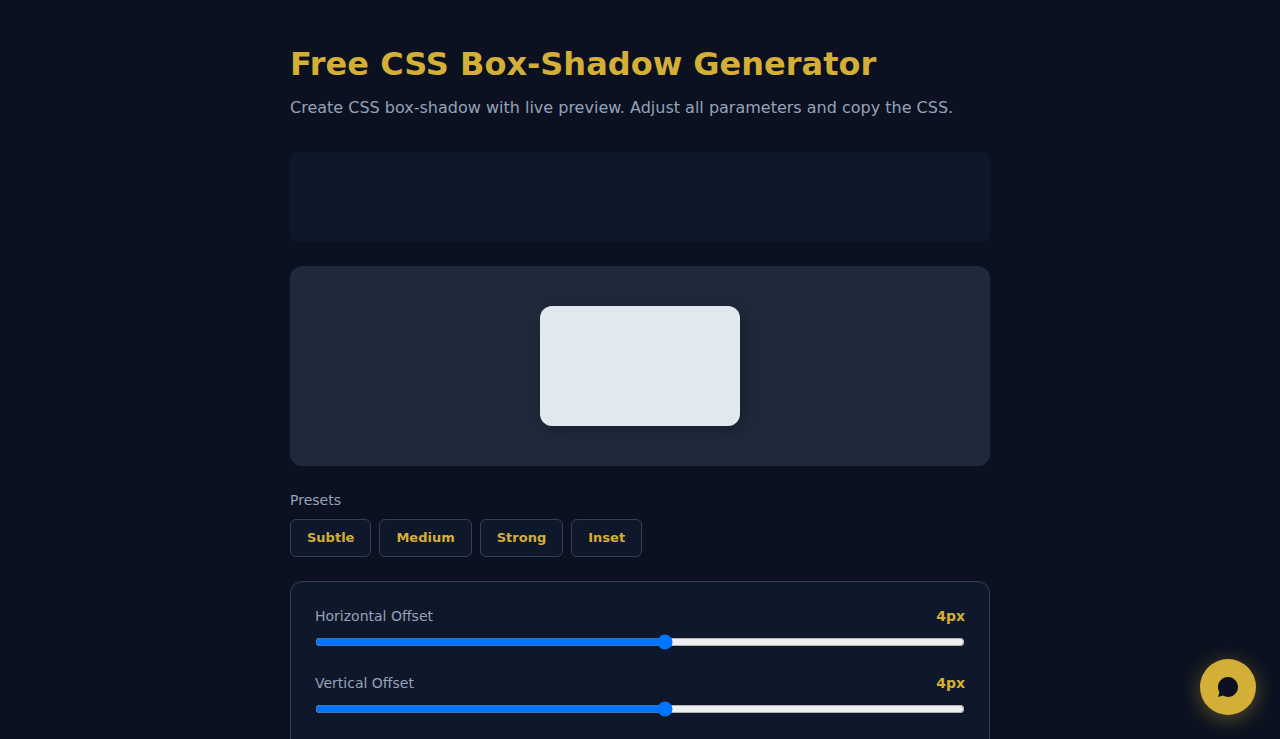
So verwenden Sie den CSS-Box-Shadow-Generator
Passen Sie die Regler für horizontalen und vertikalen Versatz, Unschärferadius, Ausbreitung, Farbe und Deckkraft an, um den perfekten Schatten zu erzeugen. Aktivieren Sie inset für Innenschatten. Die Live-Vorschau aktualisiert sich sofort, sodass Sie genau sehen, wie der Schatten aussieht. Klicken Sie auf CSS kopieren, wenn Sie zufrieden sind.
Wann CSS-Box-Shadows einsetzen
- Tiefe und Erhebung für Karten, Buttons und Modals im UI-Design erzeugen
- Neumorphismus- oder Glassmorphismus-Effekte mit Inset-Schatten erzeugen
- Hover-Zustände und interaktives Feedback für Webkomponenten prototypisieren
Haeufig Gestellte Fragen
Kann ich mehrere Box-Shadows auf ein Element anwenden?
Ja. CSS erlaubt durch Kommas getrennte box-shadow-Werte. Erzeugen Sie jeden Schatten einzeln mit diesem Tool und kombinieren Sie sie dann in Ihrem Stylesheet für mehrschichtige Tiefeneffekte.
Was ist der Unterschied zwischen Inset- und normalen Schatten?
Normale Schatten erscheinen außerhalb des Elements und erzeugen einen erhabenen Effekt. Inset-Schatten werden innen gezeichnet und wirken eingedrückt, wie es in neumorphen Designs üblich ist.
Speichert dieses Tool meine Einstellungen?
Nein. Die gesamte Verarbeitung erfolgt vollständig in Ihrem Browser. Es wird nichts gespeichert oder an einen Server gesendet.
Alles wird lokal im Browser verarbeitet. Keine Daten werden gespeichert oder uebertragen.
Diese Tools sind für immer kostenlos. SARA geht weiter.
SARA ist Ihr KI-Agent auf WhatsApp: beantwortet Kunden, nimmt Buchungen an, macht Follow-ups — rund um die Uhr, automatisch. 14 Tage kostenlos testen.
Kostenlose 14-Tage-Testphase starten →