Free PX to REM/EM Converter
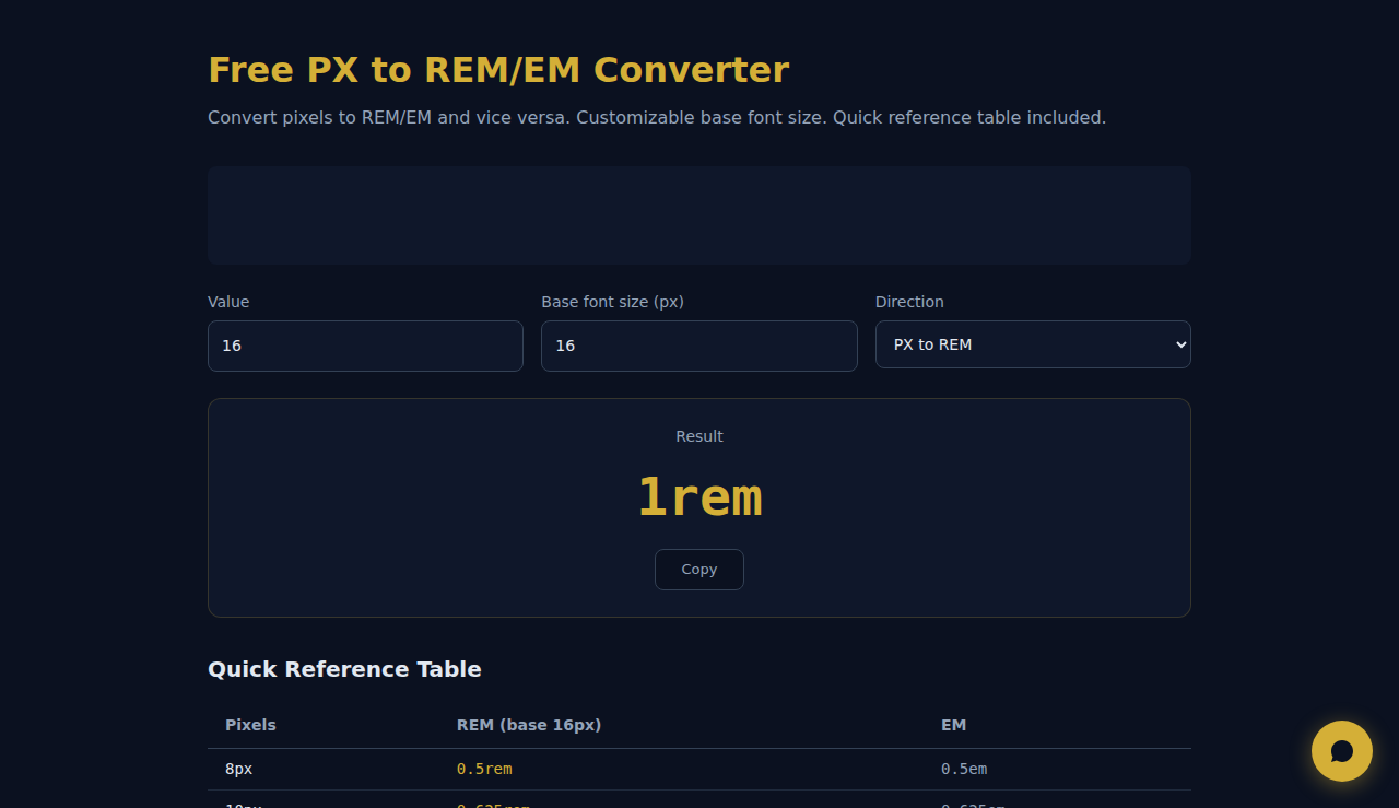
Convert pixels to REM/EM and vice versa. Customizable base font size. Quick reference table included.
Result
1rem
Quick Reference Table
| Pixels | REM (base 16px) | EM |
|---|---|---|
| 8px | 0.5rem | 0.5em |
| 10px | 0.625rem | 0.625em |
| 12px | 0.75rem | 0.75em |
| 14px | 0.875rem | 0.875em |
| 16px | 1rem | 1em |
| 18px | 1.125rem | 1.125em |
| 20px | 1.25rem | 1.25em |
| 24px | 1.5rem | 1.5em |
| 28px | 1.75rem | 1.75em |
| 32px | 2rem | 2em |
| 36px | 2.25rem | 2.25em |
| 40px | 2.5rem | 2.5em |
| 48px | 3rem | 3em |
| 56px | 3.5rem | 3.5em |
| 64px | 4rem | 4em |
Speed up your frontend workflow with SARA AI Agent
How It Works
Enter a value in pixels, rem, em, or points and instantly see the equivalent in all other units. Set your base font size (default 16px) to ensure accurate rem/em calculations. The converter updates in real-time as you type. All conversions happen locally in JavaScript — no server calls needed.
When to Use It
- Converting design mockup pixel values to rem units for responsive CSS implementation.
- Translating print design specifications (points) to web-friendly units (pixels, rem) and vice versa.
- Ensuring consistent typography across a design system by standardizing on rem-based sizing.
Frequently Asked Questions
Why use rem instead of pixels?
Rem units scale with the user's browser font size preference, making your site more accessible. If a user sets their browser to 20px base font, rem-based layouts automatically adjust while pixel-based ones do not. This is especially important for visually impaired users.
What is the standard base font size?
All major browsers default to 16px. This means 1rem = 16px unless overridden. Some developers set html { font-size: 62.5% } to make 1rem = 10px for easier mental math. Adjust the base font field in this tool to match your project settings.
How do points relate to pixels?
At 96 DPI (standard screen resolution), 1pt = 1.333px. This ratio comes from the print standard of 72 points per inch divided by 96 pixels per inch. When converting print designs to web, this factor ensures text appears at the intended visual size.
No data is sent to any server. All processing happens in your browser.
These tools are free forever. SARA takes it further.
SARA is your AI agent on WhatsApp: answers customers, takes bookings, follows up — 24/7, automatically. Try it free for 14 days.
Start your free 14-day trial →