Free CSS Flexbox Generator
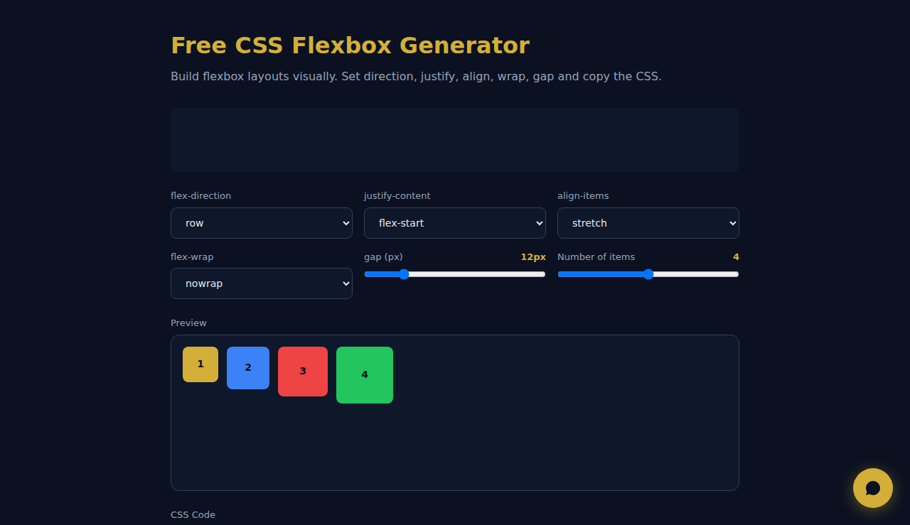
Build flexbox layouts visually. Set direction, justify, align, wrap, gap and copy the CSS.
1
2
3
4
display: flex;
flex-direction: row;
justify-content: flex-start;
align-items: stretch;
flex-wrap: nowrap;
gap: 12px;
How It Works
Adjust flexbox properties like direction, justify-content, align-items, gap, and wrap using visual controls. The live preview updates instantly as you change settings. Copy the generated CSS to use directly in your stylesheet.
When to Use It
- Layout prototyping — experiment with flex properties visually before writing code.
- Learning CSS flexbox — understand how each property affects layout by seeing changes in real time.
- Quick CSS snippets — generate copy-paste-ready flexbox code for navigation bars, card grids, or centering content.
Frequently Asked Questions
Does it support CSS Grid too?
This tool focuses on Flexbox only. For CSS Grid, use our dedicated grid generator tool.
Can I add more child items?
The preview uses a fixed number of items to demonstrate layout behavior. The generated CSS works with any number of children in your actual project.
Is the CSS compatible with all browsers?
Flexbox is supported by all modern browsers including Chrome, Firefox, Safari, and Edge. IE11 has partial support with some quirks.
All processing happens in your browser. No data is sent to any server.
These tools are free forever. SARA takes it further.
SARA is your AI agent on WhatsApp: answers customers, takes bookings, follows up — 24/7, automatically. Try it free for 14 days.
Start your free 14-day trial →